
TIMELINE: 4 Weeks
PLATFORM: Responsive Website
TOOLS: Figma, Figjam, Miro, Maze, Optimalsort
MY ROLES: UX Designer, UI Designer, Researcher
What is Parachute?
OVERVIEW
Parachute is an insurance company that has successfully been selling insurance B2B for 30 years, priding themselves on their low costs. Despite low costs and many offerings, they are struggling in this new digital world. They would like to start selling directly to consumers.
Users find the process to get insurance confusing, boring and time consuming.
When it comes to insurance, users want the cheapest and quickest option. They don’t want to spend extra time on something that they find boring and don’t understand (and don’t want to understand). The typical process is long, confusing, boring, and ends up giving them a quote that they can’t afford.
THE PROBLEM
A simple process, with clear direction, that takes as little time as possible.
THE SOLUTION
A simple process
Takes less than 5 clicks to start getting a quote.
Language that is clear, concise, and easy to understand.
A consumer has an attention span of 8 seconds, so a simple and easy process is key.
A clear direction
A progress bar keeps users motivated and reduces uncertainty.
Buttons with specific language on what is next help to orient users.

Short on time? Feel free to jump to the final designs! 🤗
Otherwise, keep scrolling to learn more about my process.

Let’s get down to the nitty gritty.
THE PROCESS
How did I end up with this solution? Why did I make certain decisions? What were my research findings and what did I learn?
Originally, I thought that users wanted to learn more.
HYPOTHESIS
Before interviews, I thought that the reason users don’t care about insurance was because they didn’t know much about it. Everyone knows that they need it but not many understand the details. After talking to users, this was not the case at all.
Understanding user needs when buying insurance.
INTERVIEWS
After conducting secondary research I started on user interviews. I conducted 4 in person interviews, each lasted 30-45 minutes. I really tried to dig in to why users chose their current insurance provider, what they really want from an insurance company, as well as their frustrations. During these conversations, a few things stood out when it came to user needs when buying insurance.
Price
Users want to make sure they are getting the best deal so it is the biggest factor they consider when purchasing insurance.

Time
Users value their time and want to spend as little of it as possible on purchasing, and thinking about, insurance.

Convenience
Users want to do everything online. The the less time they have to spend calling and talking to customer service the better.

Clarity
Users want to have what is covered in their insurance plan clearly laid out.

THE PERSONA
Meet Peter
After synthesizing all of the research conducted, I created a persona that I thought would best represent Parachutes’ target user.

Link to persona here
Building a framework for design.
DESIGN
Based on the research conducted and my persona, I created a Sitemap, User Flow, and Task Flow in order to make informed design decisions. All 3 focused on the get a quote process as this was the main and sometimes only reason users visited insurance websites. From there, I dove into sketches, keeping Peter’s wants, needs, motivations and frustrations in mind.
Sketches
What would Peter need most? Based on my research, I wanted to Include the following elements in my design:
Highlight Getting a Quote as users said this is one of the main reasons they visit insurance websites.
100% of users said they think insurance is boring, complicated, and confusing so I wanted to include elements that would catch a user’s eye and draw them into the site.
Focused on the landing page in these initial sketches
Lo-Fidelity Wireframes
There wasn’t one sketch I thought was going to 100% meet my user’s wants and needs so I ended up merging and expanding on a few of the sketches. The landing page is organized with a hierarchical structure, the most important task and information at the top and least important toward the bottom.
Ideally, I would have wanted to implement user testing at this point and ideate from there. Due to time constraints and project deadline, I was unable to implement testing at this stage.

Just 3 examples of my 20+ wireframes. See more here
UI Kit
After wireframing, I created a UI Kit to provide a framework of elements, colors, design patterns, etc. As I made adjustments to the site I continued to update the tool kit. See more here.

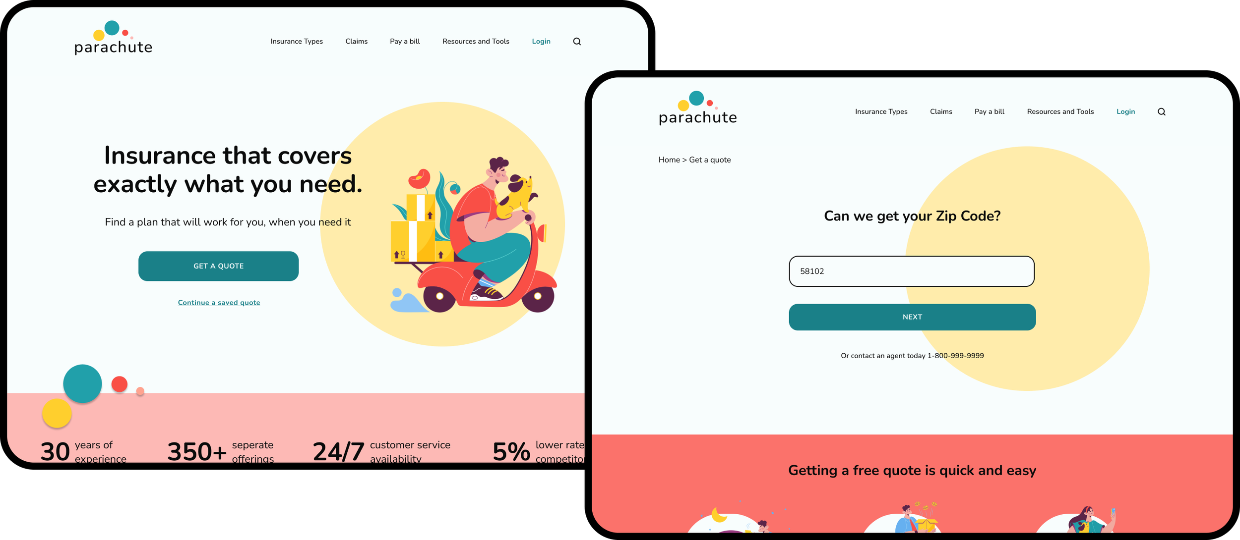
Hi-Fidelity Wireframes
I added elements from the UI Kit into the wireframes. After many iterations, I landed with the below. I wanted to grab the user’s attention but didn’t want to distract them from their ultimate goal of getting a quote. See more here.

Usability testing using my hi-fi prototype
TESTING
After creating hi- fidelity wireframes and a prototype, I created a plan for an unmoderated test using Maze. This test included 3 tasks for users to complete with 2 questions after each task about various design elements.
Test Objectives
Test if users can find the get a quote button with little to no difficulty.
Test if the site provides enough information and direction for users to easily get a quote.
Test if users feel they can trust the site.
Identify pain points in the get a quote flow.
After usability testing, there were 3 very clear confusions.
ITERATIONS
I received a ton of feedback from my usability testing. Overwhelmed with the amount, I created an affinity map to organize the feedback and recognize patterns in the data.
The biggest successes:


The biggest confusions:


Updates made after testing
1. Choosing an insurance type and verbiage
I originally had all options on one page, where users were able to click as many insurance types as needed from the drop-down. This was ultimately confusing for users so I split it up into 2 pages and updated the interface.
For the insurance types, I originally had “Condo”, “Apartment”, and “House”. During testing, users pointed out that this was confusing as someone might rent a house. So verbiage was updated to “Home Owners” and “Renters”.

2. How to go back and add another insurance type
This was a simple fix. I originally had not prototyped the progress bar but by adding this option, it allows users to jump between pages without having to click the back button multiple times.


FINAL THOUGHTS
Reflection
During my time working with Parachute I was able to develop a brand as well as a responsive website (with a focus on getting a quote) from the ground up. Talking directly with users gave us a unique insight that was necessary to create the final product.
Next steps:
Another round of usability testing targeting the get a quote flow. Do users feel prepared going in to the request?
Further iterations based on testing.
Pass designs off to developers