
TIMELINE: 4 Weeks
PLATFORM: Mobile App
TOOLS: Figma, Figjam, Optimal Workshop, Maze
ROLES: UX Designer, UI Designer, Researcher
OVERVIEW
What is SkiTown?
Ski town is an app that works to unite the nordic ski community in Minneapolis with a focus on social interactions . The app allows users to discover and join groups in their community. It also allows users to discover new trials in their area and get information about the trail such as elevation gain, trail conditions, etc.
Skiers are facing a huge issue, especially after COVID.
THE PROBLEM
Many people learned to nordic ski during COVID as a a way to get outside but are finding that not lot of their friends know how to ski. People don’t want to ski alone, especially if they aren’t as experienced in the sport but aren’t sure where to meet other skiers.
Creating an app that allows users to join local groups and explore new trails.
THE SOLUTION
Allows users to connect and ski with other skiers in their area that share similar interests.
100% of users interviewed said that they would be more comfortable meeting up with a group than with an individual.
Join local groups in your community

Explore your area and find new trails
Users want to explore their area and ski new trails but are unsure where to find new trails.
100% of users said they get bored skiing the same trail and would ski more than once a week if they could find new trails in their area.

Just want to see all of the final screens? I don’t blame you. Skip all the details with the button below

THE PROCESS
I ran into more roadblocks than I thought I would.
I am not going to lie, I didn’t foresee this being as much work as it was but I loved coming up with creative solutions to my issues. Read on to find out more.
IDEA GENERATION
Solving for actual issues
Through preliminary research, I was presented with 2 drastically different issues that users were facing. The one that stuck out was related to nordic skiing. People love to ski but there isn’t one place where they could get information about it. This presented a unique opportunity and niche problem space that excited me.
What is actually out there?
INITIAL RESEARCH
I started by doing some secondary research and completing a competitive analysis. I wanted to identify what patterns similar apps were utilizing that users might already be familiar with and what features different apps offered.

My Hypothesis going into inteviews.
HYPOTHESISS
Based off of some initial research and analyzing different products, my original hypothesis was that users would like suggestions on waxing, what to do for the weather, layers, and what the conditions looked like.
Right off the bat I had some issues
INTERVIEWS
I struggled to find people who were available to interview about nordic skiing. After many scheduling conflicts I was able to talk to 3 users over Zoom. Since that was definitely not enough data, I turned to reddit.
I couldn’t find a clear pattern and was worried that I didn’t have a real problem.
Turns out my original hypothesis was wrong. I didn’t realize it till I started making an empathy map and organizing my data, but users don’t know a ton of others that know how to nordic ski. What they really wanted was to be able to ski with people in their community.
Insights:
of users mentioned having to go to multiple places for information about trails, conditions, etc.

of users want to ski with others but don’t know where to meet these people.

User Pain Points:
“Not a ton of people I know want to go skiing or know how to.”
“I don’t have. a ton of people to ski with these days and I miss that.”
“Seems like a lot of people in Minneapolis ski but where do I find these people?”
“There isn’t one place I can go to get info about trails.”
Things users like:
“There are a couple of amazing ski shops in my area!"
“Conditions on the trails usually mirror what my yard looks like.”
“Equipment will last forever and you don’t really have to buy new stuff.”
“I like to ski because it gets me outside and it helped my build confidence.”
How do I design with the user in mind?
PERSONA
Based on my initial research and interviews, I was able to create a persona that reflected the primary user of the app. This is Hazel, she is extroverted and has always viewed skiing as more of a social activity. She would love to meet other skiers in her area.
In the future, I would also create a second persona that reflects the users that don’t want to join groups and only want to get trail information.

How is Hazel going to move through the app?
USER FLOW
Research showed that users cared most about meeting other skiers and getting accurate trail conditions. This is how I decided what my flow should focus on. I wanted to make sure I would be designing the screens necessary for Hazel to have a positive and successful experience with SkiTown.
For the full flow, feel free to visit my Figjam file here

I had a lot of ideas I wanted to get down on paper.
SKETCHES & WIREFRAMES
After synthesizing my research, I put pen to paper. I tried to focus on key screens that would be critical to using the app. Focusing on the home screen, how users would find new trails, and what joining a group would look like.
-
![]()
Onboarding
-
![]()
Dashboard
-
![]()
Search
-
![]()
Trails
-
![]()
Groups
-
![]()
Search Results


Sketches turned into wireframes
Holy heckin wireframes. I created medium-fi wireframes so I could get a little more detailed and really focus on user interactions. I had a lot of iterations at this stage.
Link to my Figma file for wireframes here


PROTOTYPE & TEST
Testing the Wireframes
I implemented testing before I added the UI, I wanted feedback on the content and didn’t want users to be distracted by color or images. I set up an unmoderated test and was able to test my designs with 10 users.
Test Objectives:
Test if users are able to find the saved trails with minimal clicks.
Test if users can easily navigate the app (navigate to the area they want in less than 5 taps).
Test if users can find the groups they want to join.
75% of users struggled to find saved trails - Yikes!
TESTING RESULTS
I created an affinity map in order to organize my data and recognize patterns. Below were the biggest struggles and biggest wins after my first round of unmoderated testing.
Biggest Wins:

Biggest Struggles:

How do I make finding saved trails more intuitive?
UPDATES MADE AFTER TESTING
Based on feedback from testing, I really focused on how I could make it easier for users to find their saved trails as this is what users had the hardest time with.
Updates made included:
Split the “Trails” section into “Explore” and “Saved trails.” Testing showed that users wanted to look for their saved trails within the trails section.
Split the “Groups” section into “Explore” and “My Groups.” Testing showed that users wanted this section to act similarly to the Trails section.
Allowed users to see both their saved trails and groups they are in from their profile. During testing, 50% of users wanted to look for their saved trails in their Profiles.

UI KIT
Working with iOS
When creating this I took iOS design guidelines into account. I tried to keep things simple by borrowing items from already existing UI Kits when I could. My goal was to keep colors and patterns simple so as not to distract the user since these kinds of apps can have a lot of information. Below is a sample of what kinds of elements were included in my UI Kit.


Testing updates and adding UI
TESTING ROUND 2
I did moderated testing this round, I wanted to test the updates I made after the first round as well as how the app felt after adding the UI.
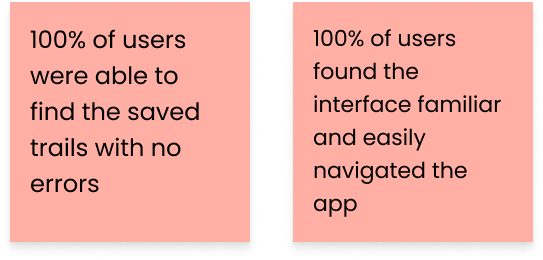
Biggest Wins:

Biggest Struggles:
One thought provoking comment made:
One user mentioned some security concerns around the profile: that when viewing other users profiles, it could potentially be a safety concern if strangers were able to see where she was skiing and what groups she was in. This really got me thinking about how users could update their settings.
Updates made after testing round 2:
Simple change to the group cards
Slightly updated the text size on the cards.
Rethinking what users can see of other users' profiles before vs. after they follow them.
FINAL DESIGNS & PROTOTYPE
Final Designs
A few of my favorite and key screens in the app are below:


Prototype
If prototype isn’t working here, feel free to visit my prototype in Figma
How did I grow as a designer?
REFLECTION
Wanted to challenge myself with a limited color palette and keeping it simple, sometimes I have a tendency to go overboard.
Focused on iOS design guidelines.
Tried to put more focus on micro interactions.
What did I learn throughout this project?
Testing early is helpful in catching confusions and issues early on before you get too invested.
Using pre-made elements instead of designing everything from scratch - this is not only helpful for me as a designer but for developers as well.
Really focusing on how different elements react to interactions is so important for a mobile app (even more than a desktop).